
 1920
2571
1920
2571
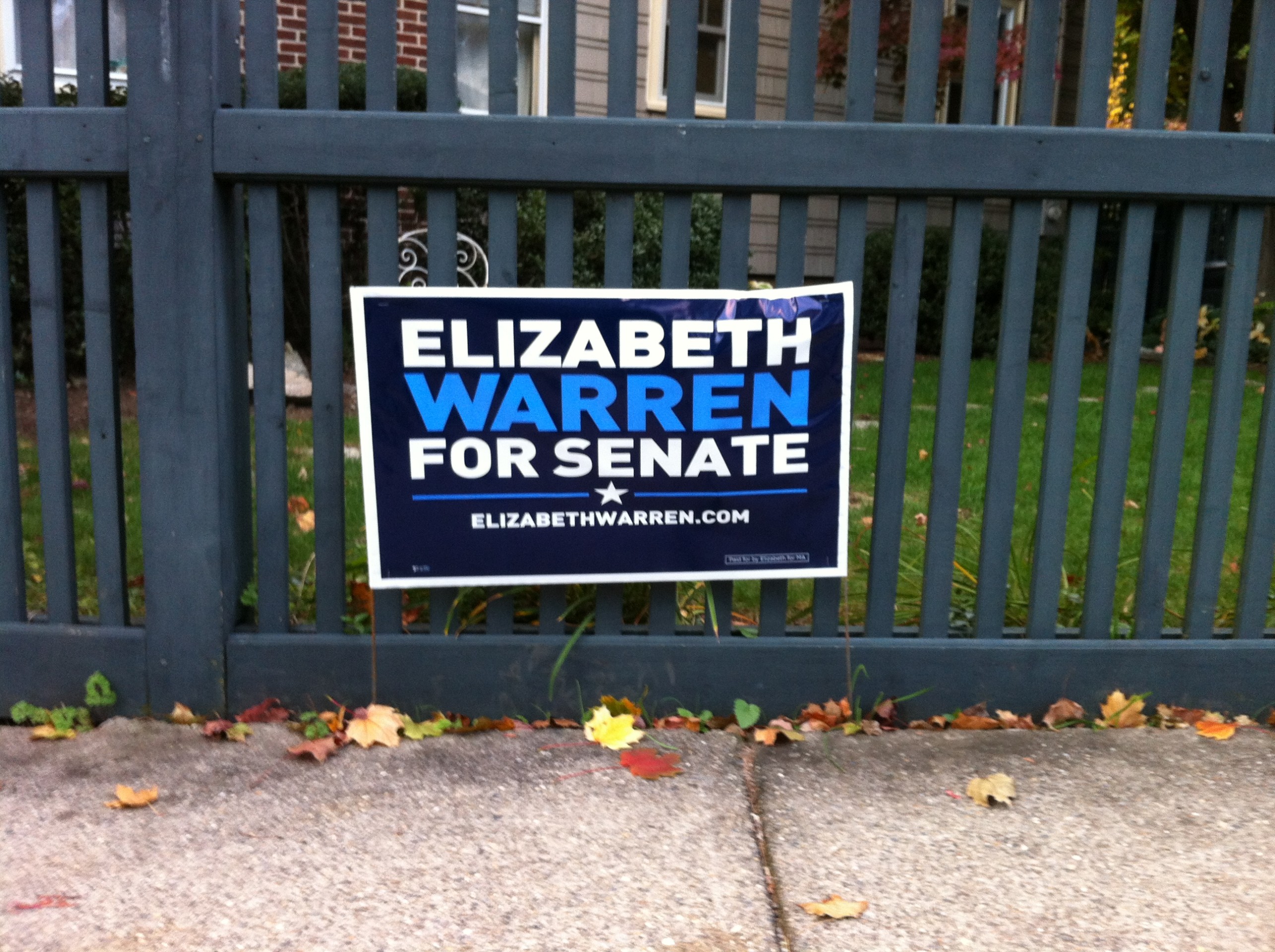
A candidate was running for State Senate and had the obligatory yard signs out in my neighbourhood. The campaign was only using the Blue and White of the required Red, White and Blue colour scheme; in this case, a deep blue background with white text. What I found odd was that the candidates last name wasn’t done in white; it was a lighter blue and seemed to blend into the background. Clearly, they were going for contrast but the result was just the opposite. This picture shows the middle word better than it usually appeared at a normal viewing distance.
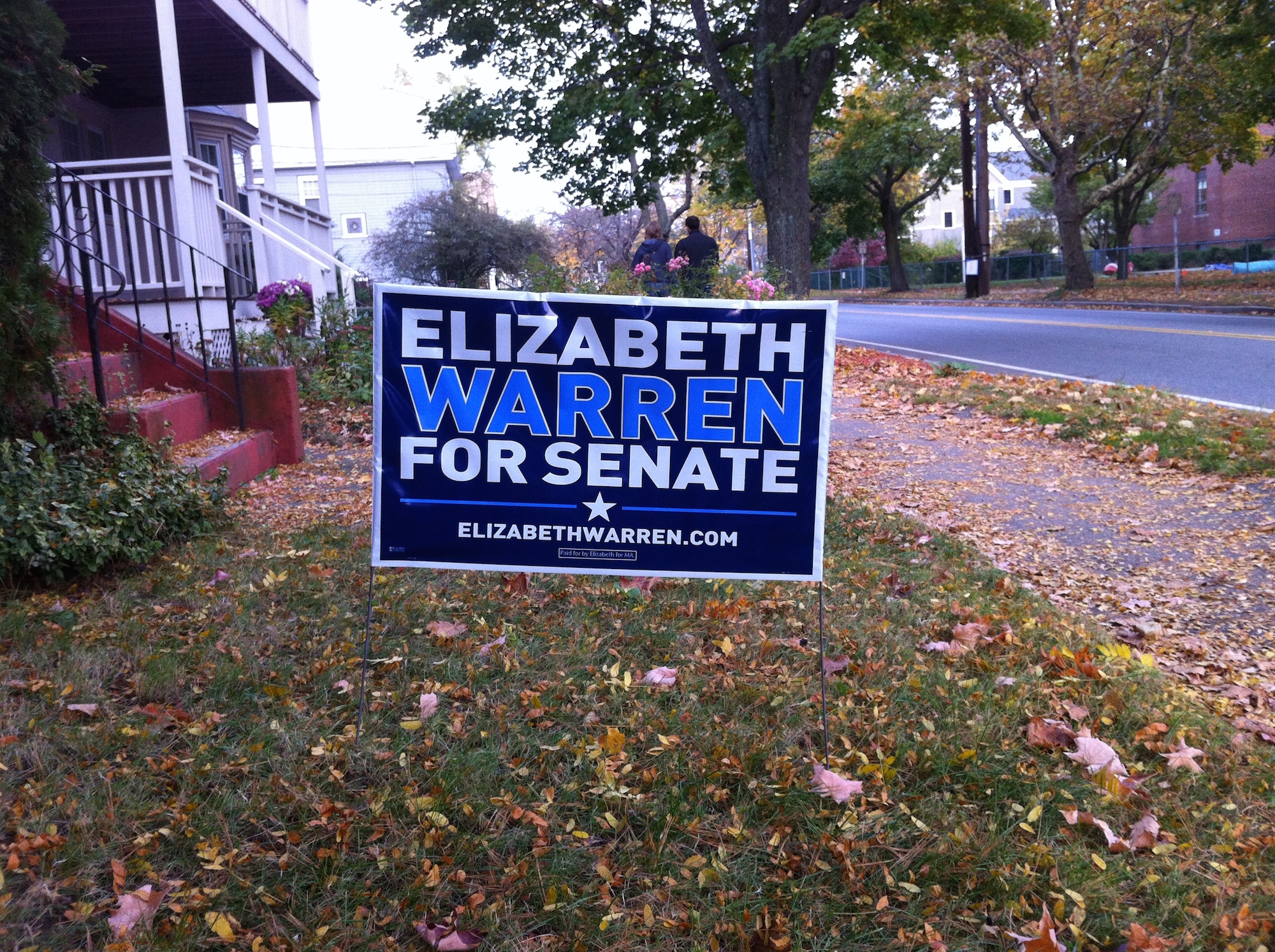
I commented on this a few times to friends but didn’t contact the campaign. However, someone else clearly did notice since right before the election, a new sign appeared on a few lawns with a slight change. Unfortunately, at any normal viewing distance, the new sign wasn’t much better; it made the name seem fuzzy rather than indistinct as before.
In the end, Elizabeth won the election so the poor colour choice wasn’t fatal. But it does show that one should test one’s designs at the anticpated viewing distance before printing a lot of signs and bumperstickers!