
After submitting the CarGurus logo for assignment 3 for the WPI class Visual Rhetoric (WR2310), the professor said, “David, solid analysis. Love the gear heads comment. It would be interesting to compare this logo to a gearhead oriented logo such as that of Speedshop or one of the race-oriented specialty auto parts franchises. And to PepBoys, which will be more similar to the CarGurus look and feel.” I decided to take up his challenge; the Pep Boys analysis is presented here. The full paper is available as a PDF
Pep Boys is a car parts and service center; they will change oil and do other preventative maintenance work on cars as well as sell parts to those wishing to do the work themselves. The logo is quite famous and uses a custom font for the name of the chain. That part of the logo is repeated several times for various services and other products (such as loyalty cards), thus repeating the branding across the site. The logo is friendly although the colour is quite bold. The italic font also is similar to Chrysler logos from the 1950s (Fig. 4).
The three faces represent the “boys” and, thus, convey some humanity to the chain. Each face communicates something about the person: the left face’s glasses say this “boy” is smart but kind of nerdy. The center face is the charming and straight-forward one with a big smile and the right-most face has a bit of a smirk and comes across as the snarky one. Note that on older logos, the left “boy” was smoking a cigar (Fig 5); the changing culture has caused them to remove the cigar but the slight turn of the face shows where it used to be.
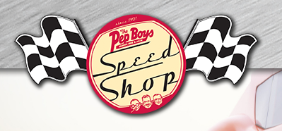
Pep Boys also has a Speed Shop section to their site. This has its own logo (Fig. 6) which, while retaining the familiar heads, communicates to a different audience. It uses an older version of the logo which coupled with the round “vintage” circle harks back to days when cars were simpler and “souping up a jalopy” was possible without a huge amount of technology and investment. The stylish font goes also conveys speed with the slight italics and swashes on both ‘S’ characters. Of course, the checkered flags tie the logo to racing as well. Note that the left-most “boy” has the cigar in this older version of the heads.