 570
1500
After submitting the CarGurus logo for assignment 3 for the WPI class Visual Rhetoric (WR2310), the professor said, “David, solid analysis. Love the gear heads comment. It would be interesting to compare this logo to a gearhead oriented logo such as that of Speedshop or one of the race-oriented specialty auto parts franchises. And to PepBoys, which will be more similar to the CarGurus look and feel.” I decided to take up his challenge and analyze other Speed Shop logos; these are posted here and the Pep Boys analysis will be a separate post. The full paper is available as a PDF
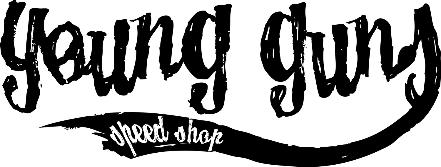
Young Guns Speed Shop is a custom motorcycle shop that (re)builds and maintains custom racing motorcycles. The logo communicates the gritty and tough world of young motorcycle builders and racers by using a distressed hand-drawn font. It also approximates the shape of a motorcycle by using the swash coming out of the last letter. The swash draws your eye to the words Speed Shop at the end. The logo projects the image of “Rough and tumble,” and “Devil may care” speed demons. The only thing for sale on the web site are T-shirts with various versions of their logo.

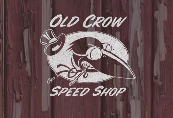
Old Crow Speed Shop is a custom car racing outfit that “strives to maintain not just the tradition of hot rod racing but also the heritage it represents…”. Their Gallery shows them restoring and refitting old cars and trucks for racing. The logo communicates both the Racing aspect via the goggles and wheels created by the scarf as well as the Heritage aspect by the fancy top hat and cigarette holder. Car racing, especially in the early days, was a sport for wealthy people. The beak of the crow also looks like a hood of an old-time race car, complete with white racing stripe. The web site sells T-shirts and other items with various logos and sayings on them.
