 864
1139
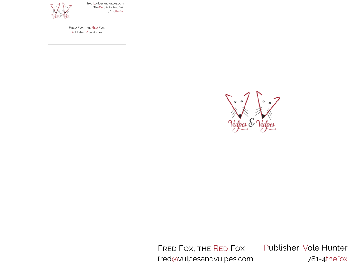
One of the daily assignments of my Graphic Design course at WPI (AR2301) was to create a small branding kit for the fictional company we created in the first project. The kit consisted of a business card and a folder cover for presentation folder that will contain 8.5” x 11” pages. There was an additional stipulation that the folder cover design couldn’t take up more than 10% of the cover; there had a lot of whitespace on the cover! Since the point of the assignment was use of whitespace, it does make sense, though.
This design also used a slightly different version of the logo. One of the complaints was that the two foxes were identical; it wasn’t clear who was whom. So I tilted each fox slightly differently so they looked (slightly) different.

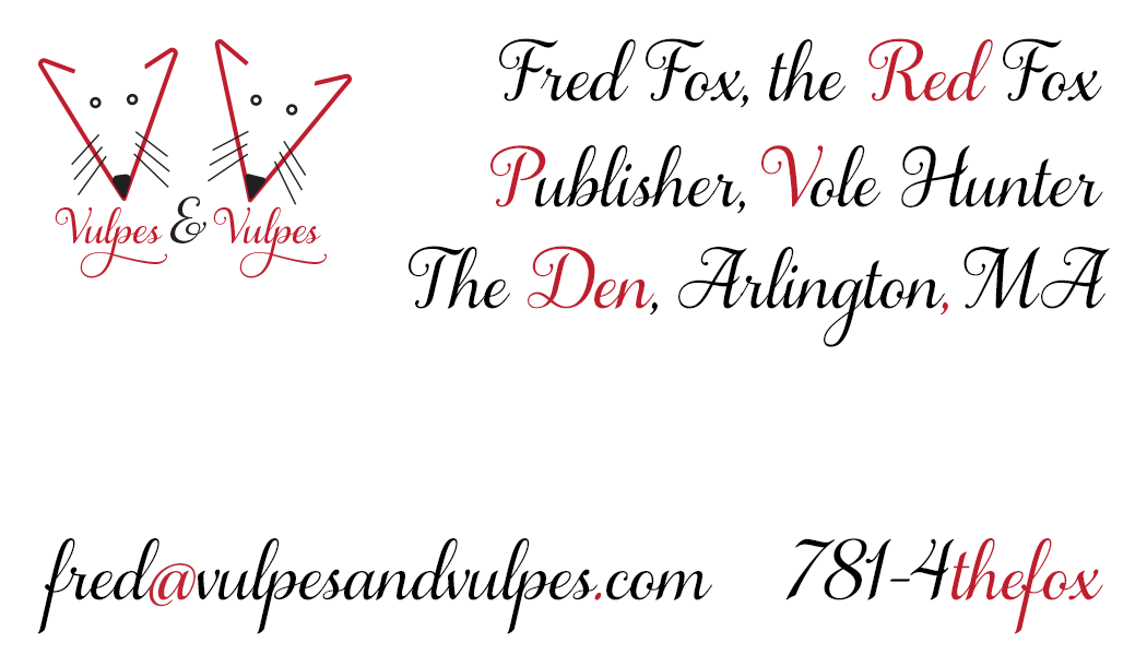
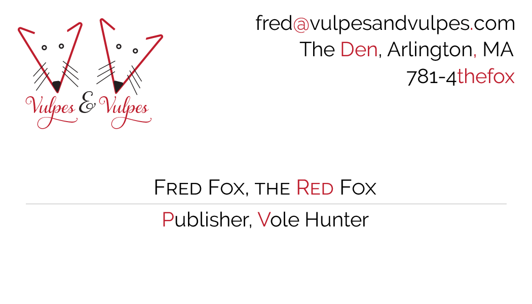
I went through a few iterations of the design based on feedback from the Professor. She wanted a larger font on the business card and folder cover so I bumped up the font size slightly. But since I was going for an elegant look, there is still a lot of whitespace. The first version (above) used a script font but it didn’t really convey the seriousness of publishing magnate. ![]() So I redid the card using a more staid but business-like font (Raleway); I do think it looks more professional.
So I redid the card using a more staid but business-like font (Raleway); I do think it looks more professional.

