- Fox outline and font: #bf1e2e
- Eyes, nose and ampersand: black
- Samantha Italic Pro
- Adobe Illustrator, Adobe Photoshop
For the first full project of my Graphic Design course at WPI (AR2301), we had to create two logos for a fictional company of our creation. We then had to produce app icons using elements of the logo(s) and a splash screen for a mobile app.
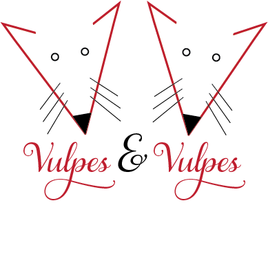
As it happens, my partner and I had invented a fictional boutique publishing company called Vulpes & Vulpes that was supposedly run by two red foxes (hence the name). See Vulpes and Vulpes Research text file for the full history as well as a description of the company, analysis of some similar sites and some word association on red foxes. The full design process, including more details of the company, is described in the description file I handed in with the rest of the assignment.
A while back, a few of us had done some brainstorming that resulted in some thumbnail sketches of logos (see below. The scan is a bit light) and I used those as a starting point for the logos.
The first logo is shown above; I used a very elegant and swoopy font called Samantha Italic Pro which fit the idea of a boutique publishing company. Since the two foxes are equal partners, they are basically identical although this changed in later iterations for other projects using this logo. Some other tweaks based on feedback from friends involved changing the nose and the from straight lines to slightly rounded. The final logo is above and the reaction to this version was quite positive.
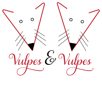
Since I had to make two logos, I tried a somewhat different idea using a san serif font that tries to look business-like but still traditional (see below). This was partly based on the initial brainstorming but was influenced by the first logo; the basic shape of the face, nose and whiskers are all very similar. But this is a more straight-forward logo whereas the first logo is more elegant and whimsical. The general consensus was that the first logo was better.
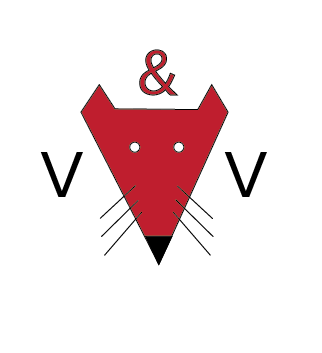
The next part of the assignment was the creation of (mobile) app icons. I found an Adobe Illustrator template online that built all the various sizes of mobile app icons from a master artboard so I used that to generate the icons. I first tried to just use the first logo (see featured image) as an app icon but at smaller sizes, it became really busy and, eventually, unreadable. It also suffered from the same problem I had had before in that the stroke width (which made the sides of the face) didn’t scale so the icon turned into a blob. Also, the logo is a rectangle instead of a square which limits the size of elements as app icons are square.
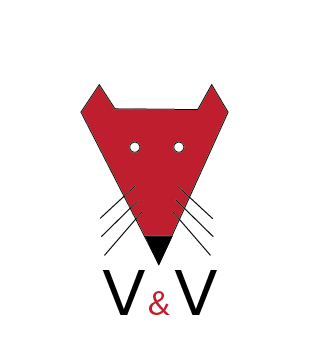
The second iteration (see below) solved those problems by having one fox face and changing to V & V instead of spelling out the whole name. It also has a nice blue background with a bit of a radial gradient behind it. This version was still quite readable at smaller sizes. The blue background did highlight the fact that there is no connecting line between the ears but I don’t think it distracts from the image too much.
Turning the second icon into a mobile app icon was quite easy as it is already square and already uses the initials; I only had to adjust the ampersand and call it a day. ![]()
The final part of the project was the creation of a splash screen for the mobile app. I had gotten a nice set of watercolor imagery (with a commercial use license) and the professor said the splash screen could be done in Photoshop so I built a little scene for the splash screen (see below). The first iteration had the cloud behind the text at the top but feedback from friends suggested it should be lower which does give some depth to the scene.
During my class presentation, the professor said that the splash screen seemed a quite different style than the logo(s) and icons, which is definitely true. But it is a friendly image and doesn’t detract from the brand so I went with it. I also didn’t have a lot of time to do another one.
The final logo underwent a few more tweaks when it was used in a subsequent branding print identity project.