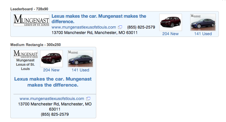
- Final ad background: AliceBlue
- Company name link: #666666
- Next mockup background: papayawhip
- Original mockup background: #efefef
- Helvetica Neue, Helvetica
- Adobe Photoshop
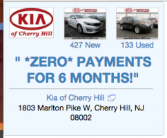
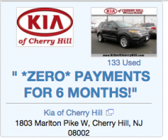
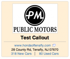
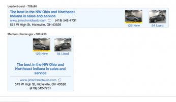
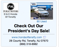
Like most sites, CarGurus runs external advertising on some pages of the site. In an effort to increase their product offerings, they decided to run their own advertising; these ads would be sold to dealers who were already paying customers. The ads would be templated in that the dealer supplied certain bits of content (mostly the callout but eventually the logo, as well) and we filled in the rest of the parts of the ad from the dealer’s info and inventory. The pictures used were pulled randomly from the featured images of that dealer’s inventory by the back end. I was asked to design ads for both leaderboard* (728 x 90 pixels) and medium format* (300 x 250 pixels); both would use the same information but it would obviously be displayed differently. There were several challenges involved. The first was that the length of the callout varied a lot between dealers. Some would say Great Deals! and others would have multiple sentences as in the featured image above. To make the text fit in the allotted space, I ended up using a jQuery plug-in that would increase the font size in steps until the text overflowed and then back it off one step. This would allow both very short and rather long callouts to look good.
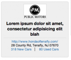
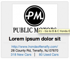
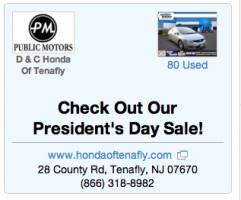
Some dealers didn’t upload a logo so the ad had to adapt to that, as well. For the leaderboard ad, it wasn’t really an issue but the medium format looked unbalanced without the logo. In that case, the inventory pictures took over the extra space and shared it evenly, increasing in size if possible. Eventually, I was asked to design a placeholder logo to encourage the dealers to upload their own.
Many dealers only sold used cars; again, this wasn’t much of an issue for the leaderboard ad but the medium format looked unbalanced. So the ad scaled up the size of the logo and the inventory picture making it look more even.
The original mockup used a gray background which was quickly changed to the named CSS colour Papayawhip; given the various blues used on the rest of the site, it was then changed to AliceBlue. I I’ve included various other iterations, including medium format ads with no pictures and versions where the logo changes size instead of the callout text.
These ads converted very well mostly because they they shared various design elements with the rest of the site and so looked like they belonged. Eventually, similar templated ads were run on other sites; they didn’t convert nearly as well in those cases.
- Standard web advertising terms and sizes
