- Background: #FFFFFF
- Testimonial section: #c0392b
- CTA Button: #18bc9b
- Footer: #193441
- Roboto
- Wireframeapp.io, Sketch
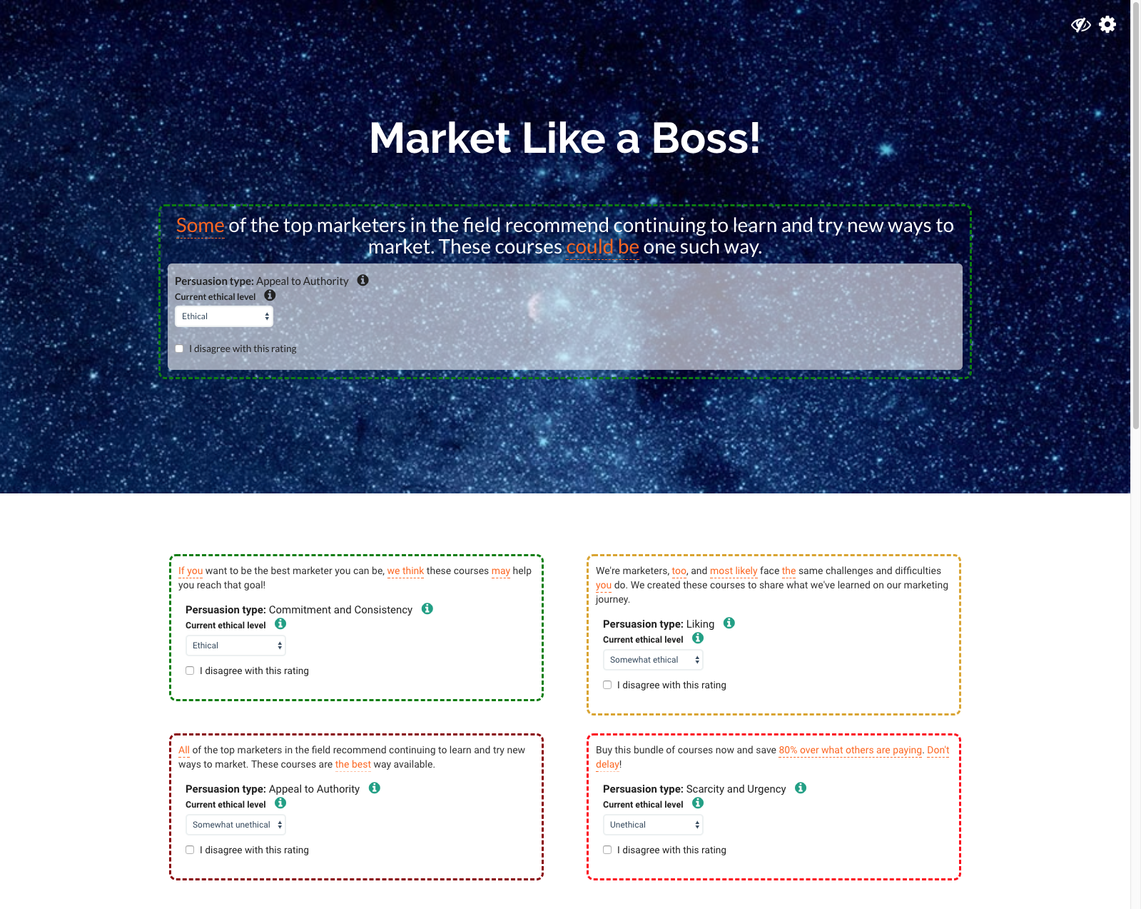
The Sufficiency is one of the four project requirements for a Bachelor of Science degree in Computer Science from Worcester Polytechnic Institute (WPI). As part of the Humanities program, each student specializes in one area within their Humanities minor; I chose Ethics within the general study of Philosophy. For my Sufficiency project, I designed and built a proof-of-concept site to illustrate ethical and unethical textual messages of various types; the six types are those popularized by Robert Cialdini. From the introduction of the final paper:
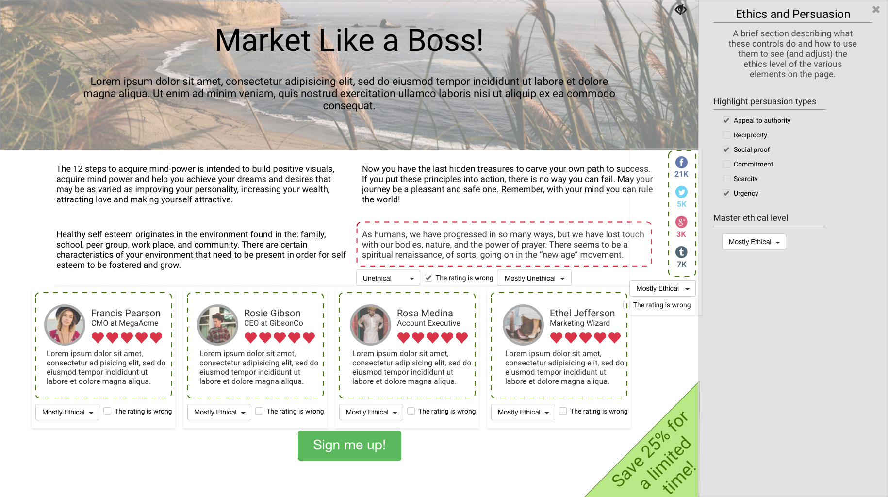
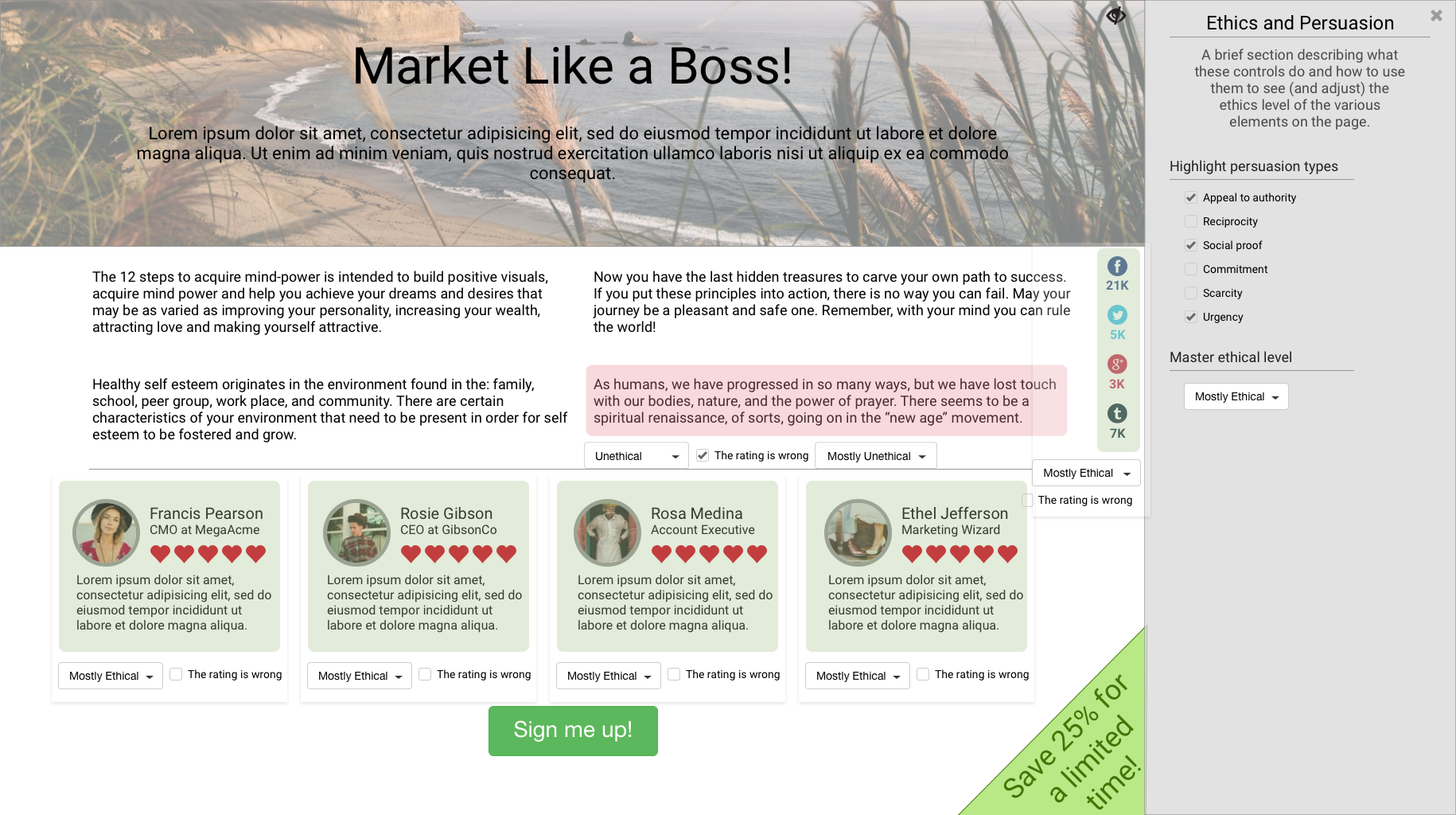
This project provides a mechanism to improve [the skill of determining if a persuasive message is ethical or unethical] by showing marketing messages of various persuasion types. The user can request the system to visually illustrate how ethical these messages are based on four ethical levels. In most cases, for any particular message, the user can select a similar persuasive message at a different ethical level, thus letting them see how the levels differ. A brief definition of each ethical level can be displayed as well. Finally, the user can disagree with the ethical level displayed if they feel the persuasive message doesn’t fit the definition given. In that case, the user can select what ethical level they feel best describes the persuasive message.
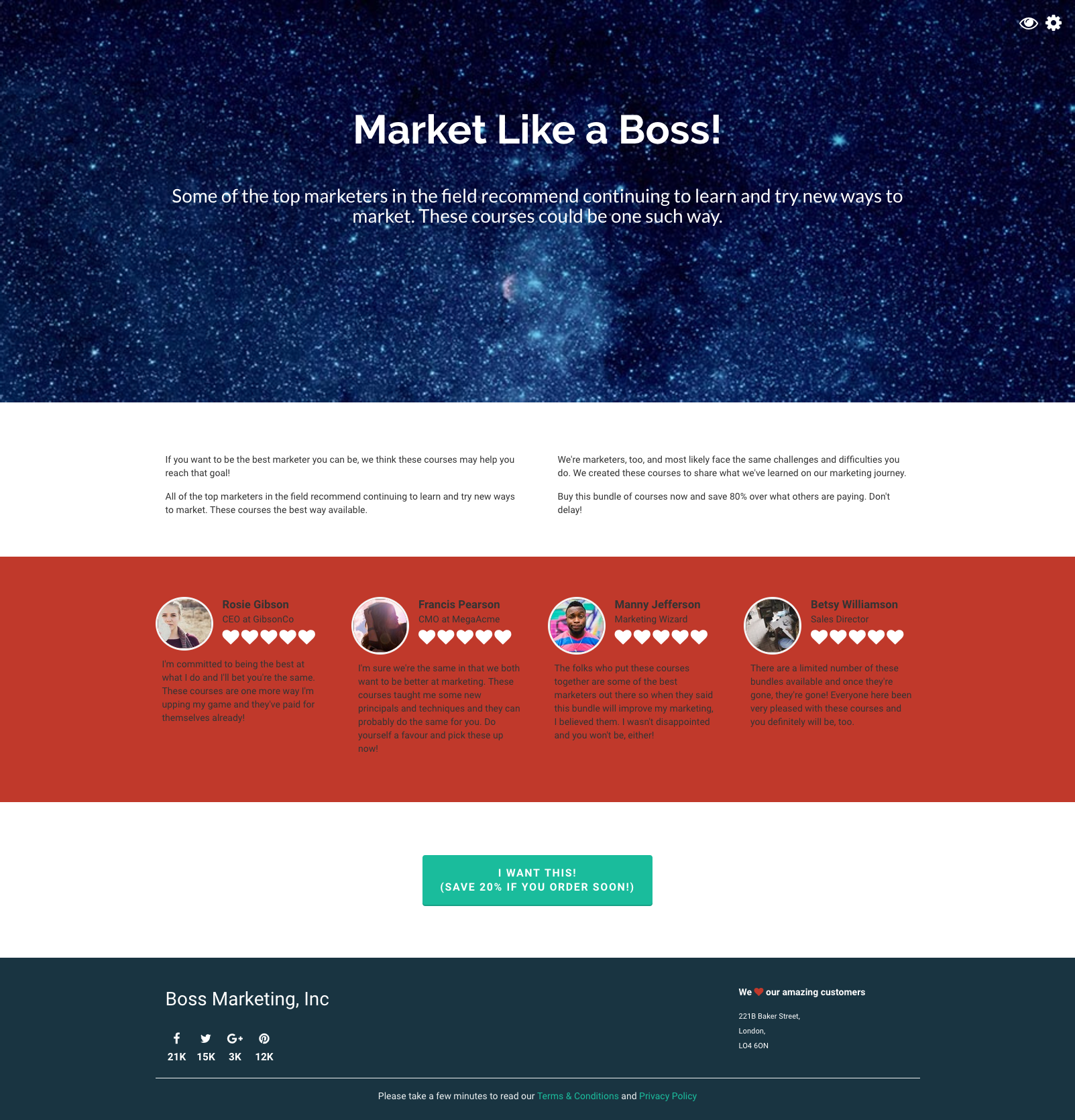
Appendix 1 of the paper discusses both the technology used to build the site and a description of the how the design evolved during the project. This includes wireframes, hi-res mockups and, finally, working code. The responsive features of the site as well as specific design challenges, such as the color of the hearts in the testimonial section and alternative ethical level selectors, are also discussed.
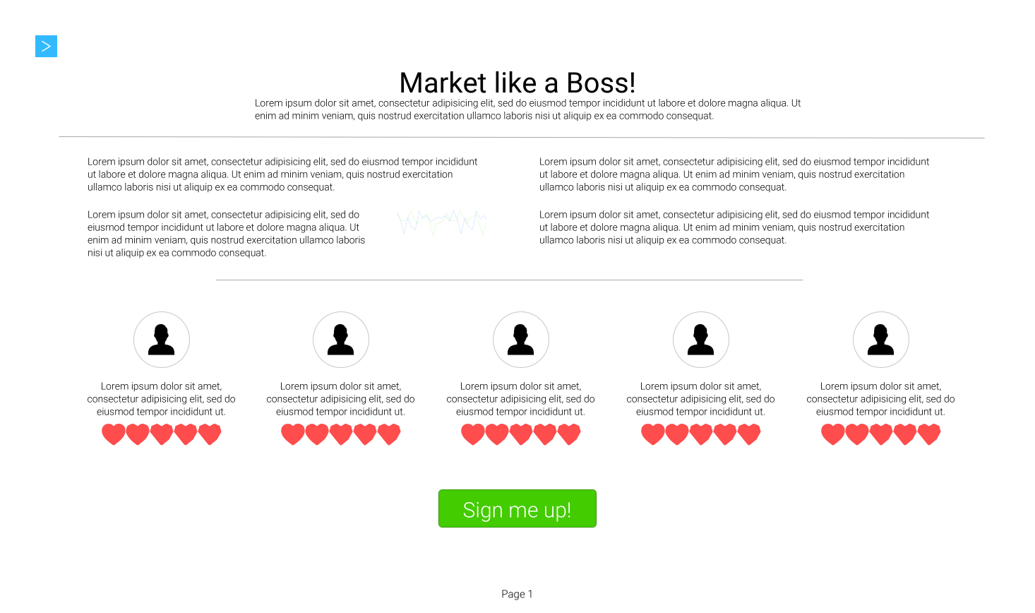
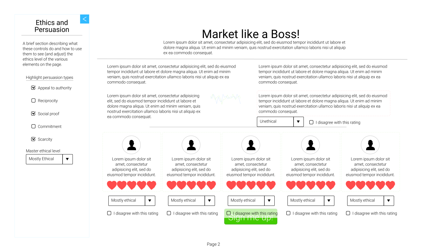
The images below show how the site design evolved. The sidebar containing master controls started out on the left but migrated to the right when I converted from the wireframe (done in an online mockup tool) to Sketch. This changed because I felt that it made more sense to have controls on the right and that the sidebar should be on the same side as the controls.
The original design had the sidebar sliding over the page but the jQuery plug-in I used ended up sliding the page over instead. This causes some of the content to slide off the screen, which isn’t ideal, but the original design would have covered up content.
Since some consider the dropdown to be the UI control of last resort, I experimented with alternate ethical level selectors. The first was a simple gradient using the western tradition of green being good/ethical and red being bad/unethical. The second was a more fun version using various emojis. Unfortunately, time constraints prevented me from implementing either of these.