- Letters: #000000
- Red Letters: #FF0000
- Copyright text: #848484
- Helvetica Neue
- Adobe Photoshop
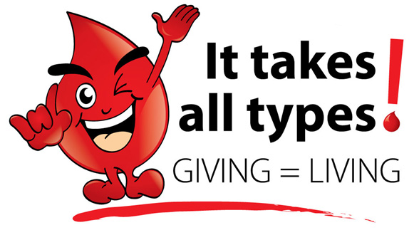
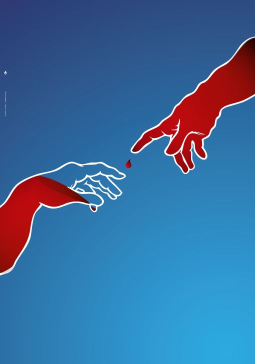
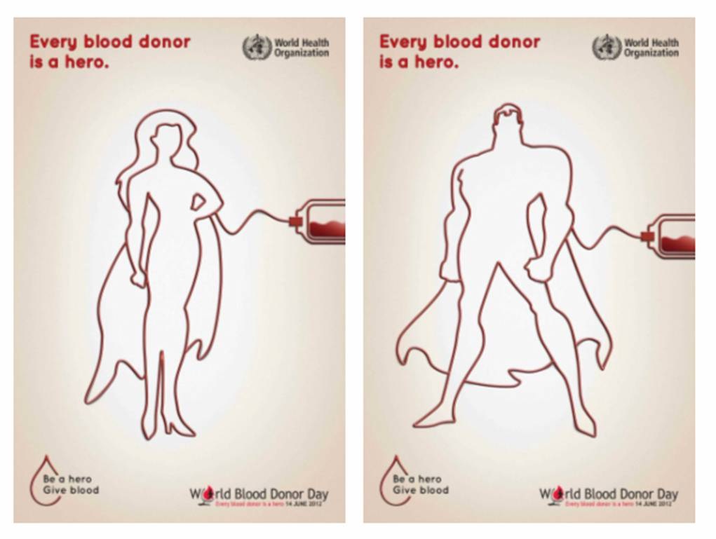
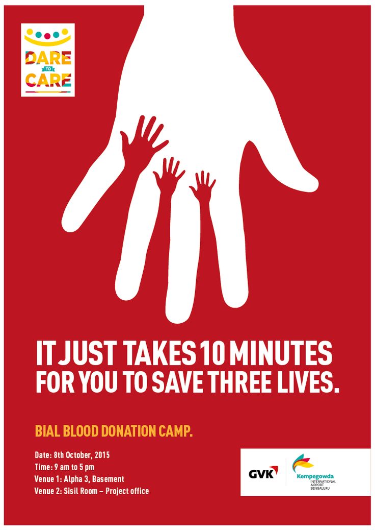
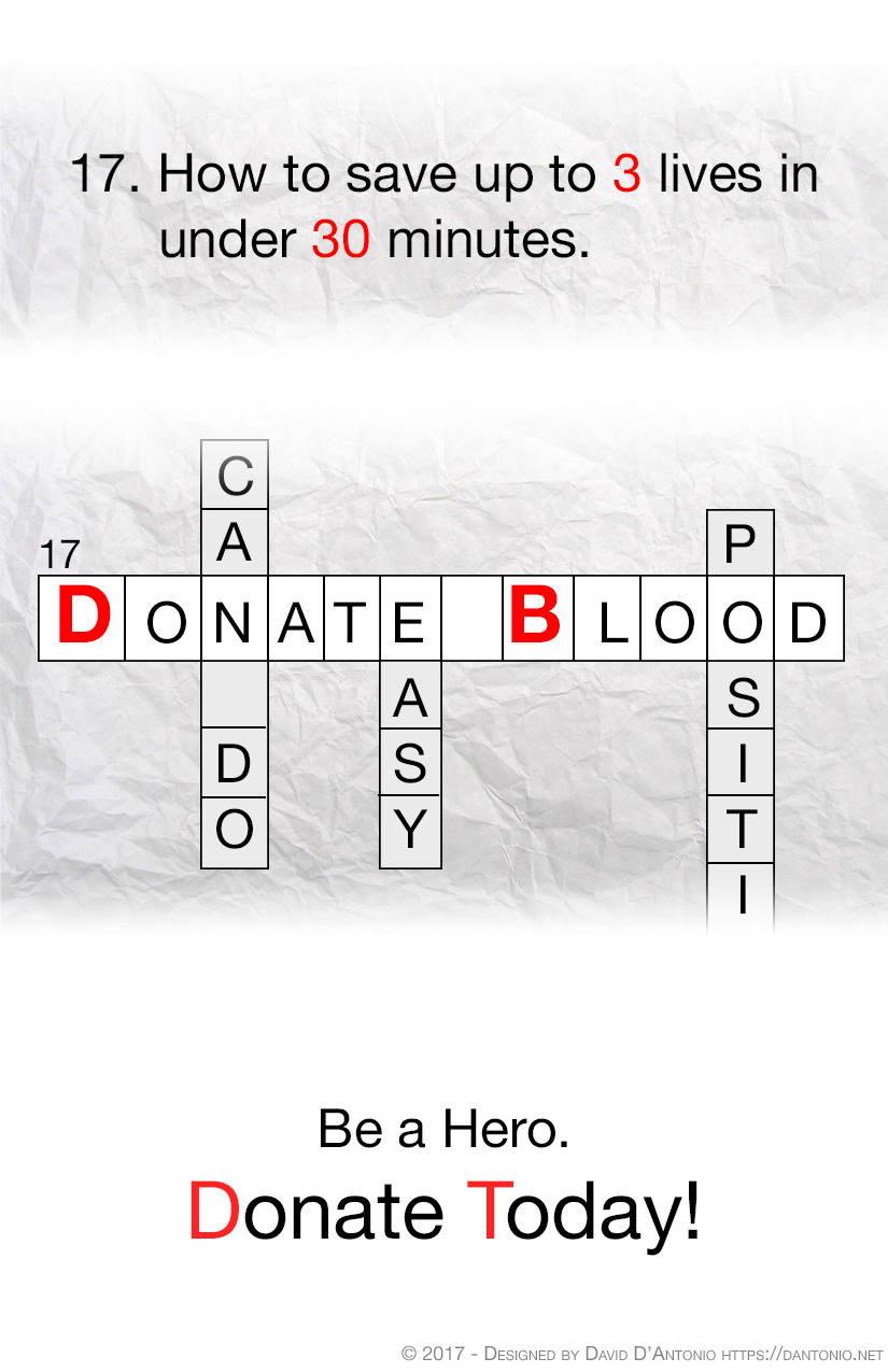
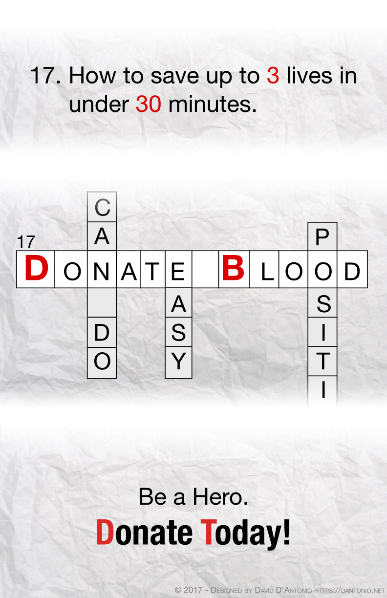
The second project for my Graphic Design (AR2301) class at WPI was to design a poster. We could select the topic and since I’m involved with a Blood Drive at a local SF/F convention, I choose that. To get inspiration, I searched the web for other blood drive imagery; I’ve included some of the images I found below. I had originally thought to do some variant on the “It takes all kinds” phrase but after seeing several poster images with the message that each pint could save three lives, I chose that phrasing, instead.
I got the idea of a crossword puzzle layout with “Donate Blood” being the answer to the featured question about saving lives. To make the poster look like it was on “paper,” I went looking for a free paper texture and found the one below. To give the poster balance, I split it into three sections with the top featuring the “clue,” the middle having the main bulk of the message and the bottom leaving space for the specific message. Since the poster would be generic, I just put in a message about being a hero; for a specific drive, the location and any sponsor could go there. To make it look more like a crossword puzzle and to reenforce the message, I had “vertical” answers saying how easy it was and that the view “can do,” and most of the word “positive.” However, all the vertical answers had a grey background so that the horizontal message would stand out.
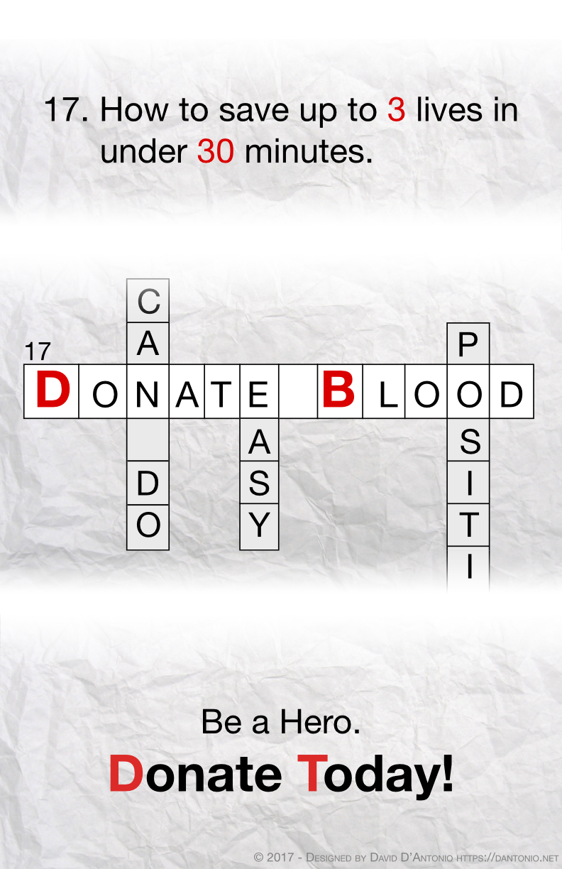
The first version is shown below. The professor said the following as feedback, “Nice concept. As much as I like the overall feel of the poster, I would use a bolder font for ” Donate Today” .” While playing around with adding (more) bolding to the “Donate Today” line, I decided to give it the paper texture background, too. It felt a bit more balanced. Even after bolding the tag line, it still looked like it could use more punch so I used a condensed version of Helvetica Neue for the final poster. I added the light grey copyright line when I sent the poster to a friend for a drive.
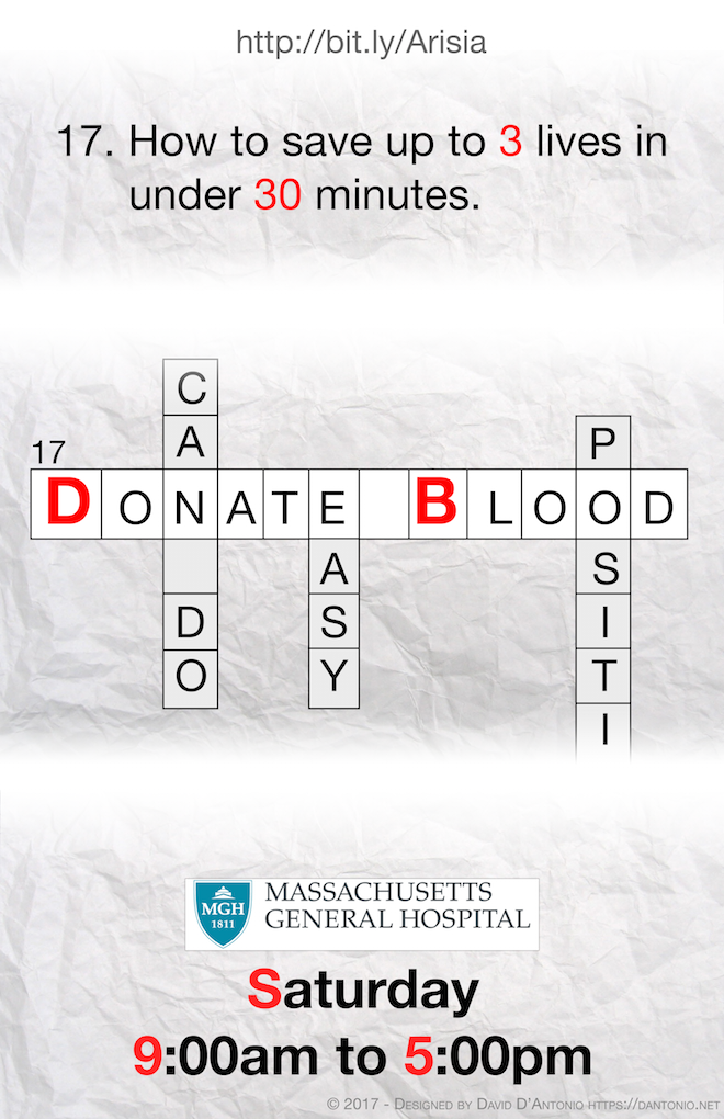
I made a customized version of this poster for the Friday and Saturday drives at a recent Science Fiction/Fantasy convention; I’ve included the Saturday poster below. Unfortunately, the actual poster was inside a convention-specified frame and the printing wasn’t the best so it looked a tad odd but both posters were well received and the drive raised 118 pints of blood!