- Foreground: #1C1C1C
- Background: #FFFFFF
- Button on hi-res mockup: #05CAB6
- Gray background: #EEF0F2
- Marker Felt Thin - Wireframe
- Montserrat - Mockup
- Sketch, Brizy
The COVID-19 pandemic has placed a lot of stress on restaurants. My partner and I wanted to support the local eateries but didn’t want to go buy gift-cards for all of them. While we had been told of a multi-business gift certificate program run by the local Chamber of Commerce, it doesn’t give money to the businesses until the certificate is used.
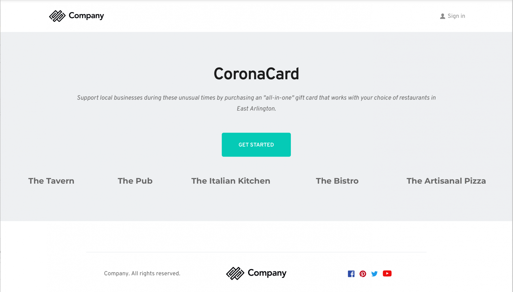
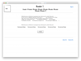
We wanted to get money into the restaurants now so this didn’t meet our needs. She had contacted a number of places and had some positive response to a multi-restaurant card so I decided to create a write-up of some of the user flows and a wireframe of a site implementing those flows. I also used the Brizy service to close a higher-res mockup of the landing page to show some visual design. Since the novel coronavirus was the reason for this project, I named it ConoraCard. ![]()
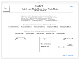
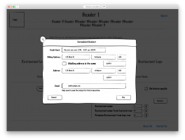
I started by writing up the purpose of the card as well as some pain points we had encountered when trying to support the local restaurants. Then I described the solution I had come up with as well as describing some representative consumer workflows. These are mainly some ways the consumer would land on the site and then progress through choosing restaurants, including the idea of featured and premium restaurants, deciding how much, in total, to put on the card. They would then be able to allocate that money to the selected restaurants or have it equally allocated automagically. They would then check out and give an email address for a receipt and be offered the opportunity to make an account. This would enable them to return later and add more money to the card or adjust which restaurants the card would cover. Once I had an idea of the flows, I went into Sketch to start wireframing using a wireframe kit I had. I did the landing page and some of the main card page. I also have a subscription to Brizy which is a site-builder with an associated Wordpress plugin. I went in and built a higher-res mockup which you can see in the featured image for this post. I’ve since built out the “Initial Visit” workflow described in the write-up, including the Checkout popup. Sketch allows one to make a clickable prototype from a design so I spent some time wiring up the artboards. Feel free to click through the prototype and send me feedback at the address in the footer.
So far, I’ve done a very small amount of user testing with positive results but until we have a number of restaurants and a bank on-board, this will likely remain a prototype.


