- Text: #000000
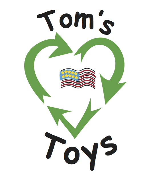
- Heart: #47A14B
- Flag Stars: #FDD944
- Stars Background: #3DA2CB
- Flag Stripes: #A92633
- Comic Sans!
- Adobe Illustrator
The second assignment in my Graphic Design class at WPI (AR2301) was to create a logo for a fictional business that a “friend” wanted to start. I’m presenting this as a case study since I have everything from the design brief to sketches to the final design.
The assignment/brief given was:
Peter has started a toy company. He is proud of the fact that all of his company’s products are made of 100% recycled plastic in the United States. The company will be launched in the summer of 2018 and will focus on manufacturing children’s toys, such as toy cars, kitchen play sets, bath time toys and others. In the following year, toys for outdoor activities and games will be added to the list. Peter has decided that 2% of the company’s profits will go to a local shelter for women and children. Peter needs help to pick a name and brand identity for his startup. He currently has a limited budget and would like you to start with a logo. He will use the logo on packaging made of recycled papers and water bottles, as well as on his website. If he is happy with your performance, he may hire you to manage the company’s entire branding efforts.
The professor had a design process she expected us to follow:
- Brainstorming word associations to generate ideas
- Search out competitors to see how they’ve communicated similar ideas
- Check visual trends for the specific industry
- Do thumbnail sketches on paper to test visual ideas
- Using the above for inspiration, create first drafts in Illustrator (or other vector design program)
- Present first drafts to client
- Using client feedback, create final presentations
- Present final designs to client
- Get paid!
Okay, the last item there is my contribution to the process.  We worked in a team with another student to brainstorm word associations; we should both produce designs and then present them together to the class. For this assignment, our word associations were:
- Children
- Recycled
- Giving Back
- Made in USA
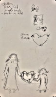
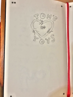
The first image below shows both the top four words we came up with as well as thumbnails of different ideas for the logo. After thinking about the logo for a while and looking around for inspirational imagery, I sketched out another iteration of the logo (see second image). A little searching found a recycling symbol in the shape of a heart that was freely available for all projects, including commercial work.
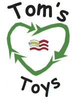
I also tried to draw something similar by hand in Illustrator but it doesn’t look very professional. However, one can make a case that a toy company doesn’t want a professional vibe so something that looks a bit childish is a good fit. This was the logo I handed in for this assignment and I’m pretty sure I got the full 3 points for it.
I am also rather amused that I found a legit use for Comic Sans!
I was a bit disappointed in how the flag at the center turned out but this is mostly due to my own inexperience with Illustrator. To get the proper thickness to the stripes in the flag, I increased the stroke width and while it looked fine at 100%, when it was shrunken, it didn’t look good at all. I’m told there is a way to reduce it such that it scales the stroke but I couldn’t find it.

