- Author text: #FFFFFF
- Title and back cover text: #000000
- Title text shadow: #692427
- Vulpes & Vulpes text: #b73d3f
- Brandley
- Brandley Shadow
- Baskerville Old Face
- Raleway
- Samantha Upright Pro
- Photoshop, InDesign
The third project for my Graphic Design (AR2301) class at WPI was to design a book cover for an existing book that we had read. Since we had been studying typography, the assignment included the restriction that we weren’t able to just illustrate the cover; the typography had to be the focus.
We all started the assignment with a “field trip” to the WPI Library where the class and the professor inspected some of the books with an eye to their covers; the professor pointed out some kinds of covers she liked and referred to the various Gestalt principals that underlay them. She also pointed out ones that used more typography than illustration to convey their message.
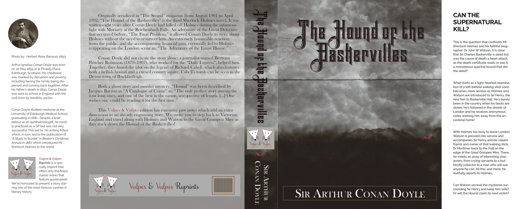
Since I’m a big Sherlock Holmes fan, I decided to do a cover for one of the best-known Holmes novels, The Hound of the Baskervilles. Most of the story takes place at Baskerville Hall and on Great Grimpen Mire (a peat bog/swamp to us Americans) nearby; the former is somewhat dilapidated but is in the process of being fixed up and the latter is dark, scary and dangerous. Add in the (perhaps mythical) Hound and you have a tale that is part murder mystery and part ghost story.
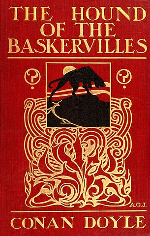
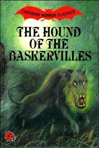
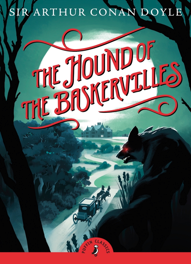
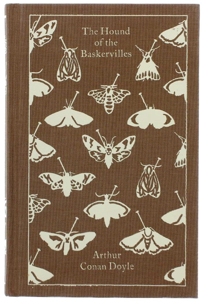
I started my research by searching for other covers; while most featured the Hound in some form (see first three images below), one featured a subtle link to the story (fourth image below). I’m indebted to BizarreVictoria for a great discussion of book covers for this story, including the subtle one I mentioned. Spoiler Warning: That site contains a hilarious description of the story so if you haven’t read the original, skip past it to the covers.
Given the general atmosphere of the story, I decided to go with a dark, brooding cover and a very old-fashion looking, gothic typeface called Brandley; to make it even more gothic, Brandley comes with a Shadow variant so the two fonts can be layered and slightly offset. This worked well for the title. I also needed a typeface for the rest of the text on the front and back covers; since I’m a bit of a font nerd, I couldn’t resist using Baskerville Old Face as a subtle tie-in with the title. ![]() To further the old-fashioned feeling, the author bio used ligatures for “st” and “ct.”
For the cover background, I started playing around with large cloud-based brushes in Photoshop. By layering a few different brushes, I got a nice dark cloudy “sky” and a brownish “ground.” (see below). One artifact of this process was a straight line about 1/3 of the way down the page. I tried various ways to remove it but ended up only slightly enhancing it so I left it in; it does nicely set off the title from the rest of the page and provides continuity since I the background is repeated across the cover, spine and back cover. The back cover has lowered opacity so the text is visible; the back cover text was carefully laid out to only show in the lighter portion of the “sky.” While I felt it slightly went against the assignment instructions, I threw in the red “eyes” of the Hound as a way to draw attention to a rather dark cover.
To further the old-fashioned feeling, the author bio used ligatures for “st” and “ct.”
For the cover background, I started playing around with large cloud-based brushes in Photoshop. By layering a few different brushes, I got a nice dark cloudy “sky” and a brownish “ground.” (see below). One artifact of this process was a straight line about 1/3 of the way down the page. I tried various ways to remove it but ended up only slightly enhancing it so I left it in; it does nicely set off the title from the rest of the page and provides continuity since I the background is repeated across the cover, spine and back cover. The back cover has lowered opacity so the text is visible; the back cover text was carefully laid out to only show in the lighter portion of the “sky.” While I felt it slightly went against the assignment instructions, I threw in the red “eyes” of the Hound as a way to draw attention to a rather dark cover.
I used a book cover template in InDesign to lay out the areas of the book, modifying it as needed. This provided areas for publisher, a photo of the author, blurbs, etc. The assignment required the entire cover which meant writing those blurbs, author bios and such! Since I knew the story well, I could write a nice summary for the inside front cover but the back cover description and author bio were mostly cribbed from various sites.
Since I needed a publisher, I chose Vulpes & Vulpes the (fictional) company I had used in previous assignments. This gave me the logo and history of the publisher for the inside flap and I could continue the joke by using terms like “paw notes” and having their reprint imprint only include works that feature quadrupeds. ![]()
We presented our covers in class and took feedback from both the other students and the professor; I presented the second iteration shown below. The feedback was generally positive but the professor didn’t like the large logo on the spine and the gray background on the logo in the cover flap. I agreed with both suggestions; the spine was kind of busy and removing the logo made the red “eyes” more prominent. Since we were able to update the cover and submit it again, that’s whatI did the result in the final cover shown above.
I was able to print it out and wrap it around a similarly sized “book” (made of a book and some small notebooks as padding) and it looked rather nice!