- Tab box background: #4a90e2
- Search button background: #f7ad45
- Helvetica Neue, Helvetica
- Adobe XD (Preview)
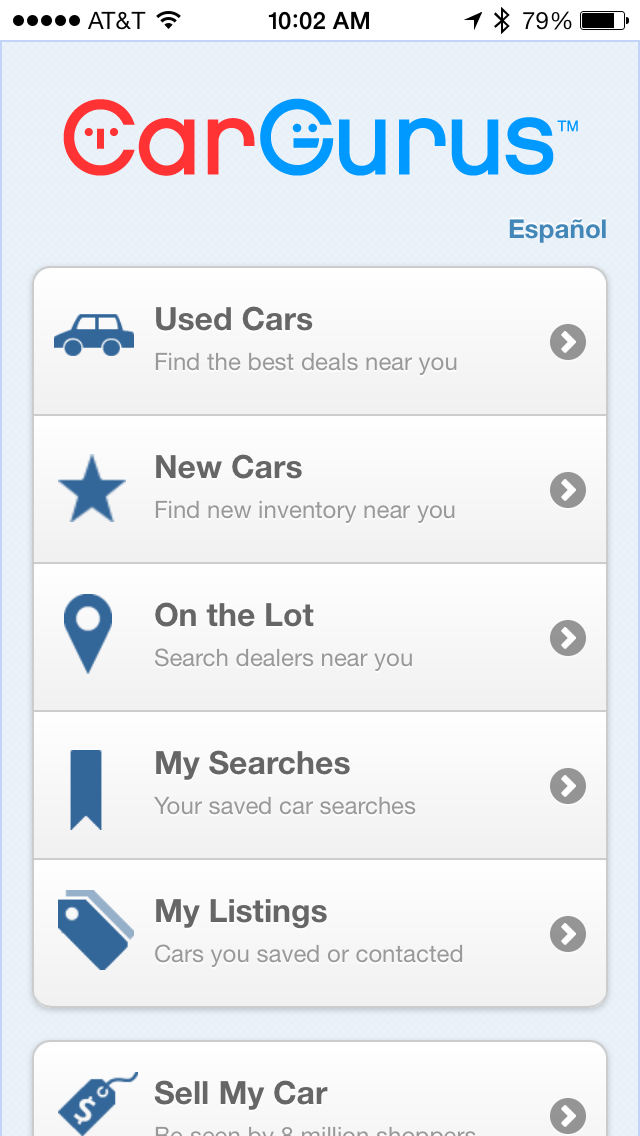
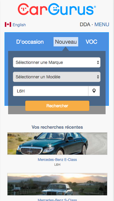
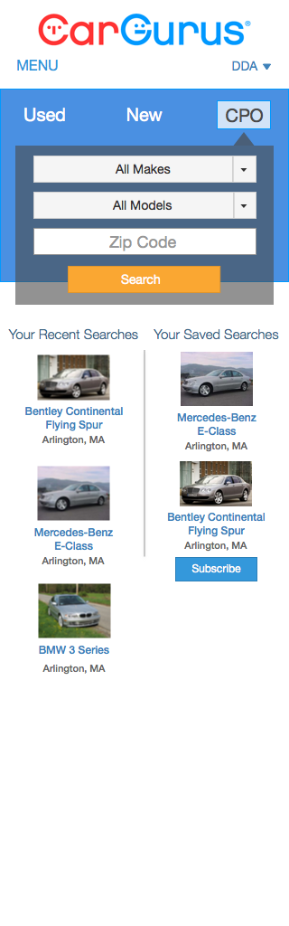
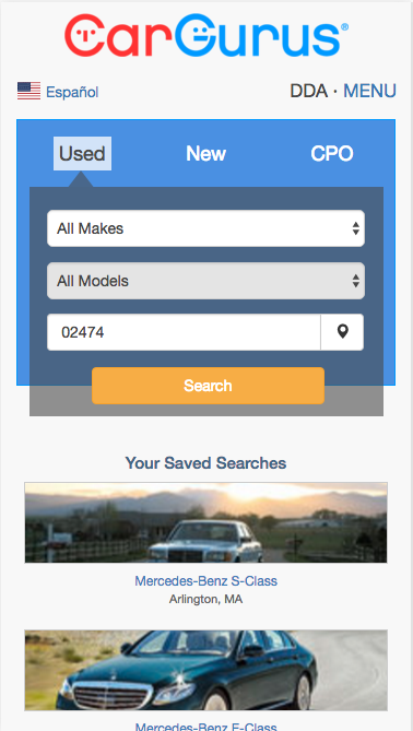
While working for CarGurus, I redesigned the homepage for their mobile web site and app. The redesign shared design elements with the desktop homepage while adapting to the mobile constraints. The original mobile homepage was simply a list of links done in jQuery Mobile; one of the goals of the new page was not to use jQuery Mobile in any way. The desktop homepage also uses the “tab selector” metaphor for the three types of searches (New, Used and Certified Pre-Owned) so I brought it over to mobile with the additional enhancement that the triangle pointer would use CSS animation to smoothly move to the new selection. The wide slice through the preferred image for the car used for the Saved Search was a happy accident; normally, there are two columns of searched display with the left being recent searches and the right being saved searches. However, if the recent search matches a saved search, it isn’t displayed so only one column is shown and the image is wider. It still looks good without taking up any extra space so we kept it.
There has been a lot of debate about the use of the hamburger menu to indicate the presence of an off-screen menu; I choose to go with the word MENU as testing has indicated that is the most recognizable choice. I did consider the potential localization issues but MENU is pretty short in the languages we supported.
When I did the layout tweaks for the French Canadian version of the site, the homepage was an issue; while in English, Used, New and CPO are about the same width so having three equally wide columns made sense. However, in French Canadian, the words are D’occasion, Nouveau and VOC; having equally wide columns looks quite odd and didn’t fit on an iPhone 5 width screen. I choose to made the column unequal but the selector still looks balanced.
This homepage tested quite well and was in use for quite some time; it has since been replaced with slight redesign that replaced the selector with actual tabs in order to replace CPO with Sell Your Car.