- Text: Black
- Helvetica Neue, Helvetica
- Adobe Photoshop, code
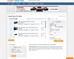
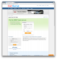
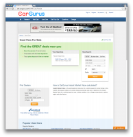
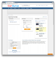
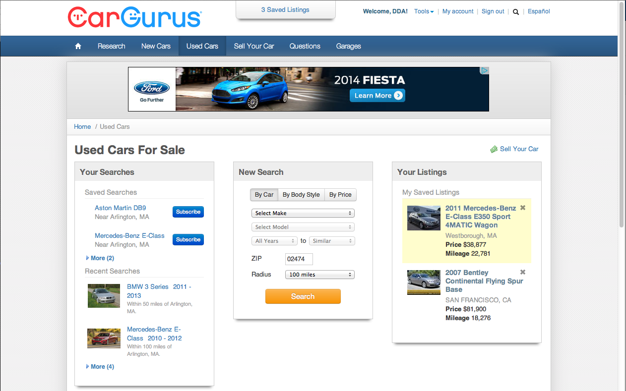
My first task was to redesign (and implement) the Used Car Landing Page. They wanted it to better feature the listings the user had saved and/or contacted as well as your saved and recent searches. I liked the box for the new searches but had seen another part of the site put that on what amounts to a card with a header. I also felt the green background with bullet points from the previous design was still useful if the user hadn’t yet saved or contacted a listing; there was enough screen real estate to show both cards and still have the green background.
I decided to go from a tabbed look for the different types of searches available to a button bar. It looks cleaner and people understand it. I was willing to give up the ability for the user to contact the dealer directly from this page; our data showed that almost no one was doing so from this page. One of the other goals was to allow users to subscribe to searches (get emailed when cars are added to the site that match their search criteria) directly from the page; I was concerned about the over-use of the Call To Action colour (the orange button) so made the Subscribe buttons blue. Note that we were using Bootstrap 2 at the time (and still are on parts of the site) so these are standard BS2 colors.
I did preserve the ability to remove a saved listing using the little X next to its entry but gave up the Details feature.
The image above is the redesigned page. We do a lot of A/B testing, especially on anything that touches the Used Car flow. This page tested better than the original one and so was adopted.
The page changes slightly if you have saved or recent searches and/or saved or contacted cars.

