Four Black Squares

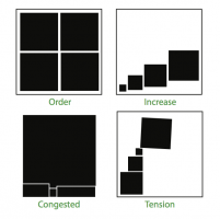
Four Black Squares assignment

I recently finished a Graphic Design course (AR2301) at Worcester Polytechnic Institute; this was the last free elective I needed to graduate. One of the assignments was to illustrate 4 words from a list of 6 (I think) with each illustration using only four black squares. The assignment had to be done in Adobe Illustrator and the squares could be partially outside each container square. The goal was to get us to “think visually” and operate within… Continue reading »

Analysis of some Pep Boys logos

Pep Boys logo

After submitting the CarGurus logo for assignment 3 for the WPI class Visual Rhetoric (WR2310), the professor said, “David, solid analysis. Love the gear heads comment. It would be interesting to compare this logo to a gearhead oriented logo such as that of Speedshop or one of the race-oriented specialty auto parts franchises. And to PepBoys, which will be more similar to the CarGurus… Continue reading »

Analysis of other car-related logos

Young Guns Speed Shop logo

After submitting the CarGurus logo for assignment 3 for the WPI class Visual Rhetoric (WR2310), the professor said, “David, solid analysis. Love the gear heads comment. It would be interesting to compare this logo to a gearhead oriented logo such as that of Speedshop or one of the race-oriented specialty auto parts franchises. And to PepBoys, which will be more similar to the CarGurus… Continue reading »

Analysis of the CarGurus logo

CarGurus logo

I took a course at WPI called Visual Rhetoric (WR2310). One of the assignments was to analyze a logo; I've included it above. The specific assignment asked us to analyze a logo and explain how it did or did not communicate the "the organization’s identity, image, positions, intention, and philosophy." The logo for CarGurus, Inc. (http://www.cargurus.com) is shown in Figure 1. CarGurus is a car… Continue reading »

A poor choice of colour

Warren Yard Sign - Before

A candidate was running for State Senate and had the obligatory yard signs out in my neighbourhood. The campaign was only using the Blue and White of the required Red, White and Blue colour scheme; in this case, a deep blue background with white text. What I found odd was that the candidates last name wasn’t done in white; it was a lighter blue and seemed to blend into the background. Clearly, they were… Continue reading »